i know when i was starting my shop, i had so many questions that i wished i could ask other digital artists, but i was way too shy to ask them. i wanted to know what kind of printer they used and what they thought of it, where they got envelopes and clear sleeves and chipboard and other supplies. so here is what i use and where i get it from, and how much it costs.
Clockwise from top right:
1. I usually get my ink from Epson online, unless I run out in the middle of a job and I need ink really quickly, in which case I will go to Office Depot (it's only $1-$2 more). Ink is $18.99 for each cartridge, and I probably buy about 3 cartridges per month. my printer uses 6 inks (CMYK plus a light cyan and a light magenta).
2. My printer is the Epson Stylus Photo 1400 Ink Jet Printer. I like it pretty well, I haven't had any major issues with it, no print heads clogging or anything, and I've had it for almost a year. It's a large format printer, so I can print up to 13"x19". Some of the more expensive printers have a light black ink, and I think that might be a better option for someone who prints a lot of grays, because my grays sometimes come out looking purple. My printer was $300 with an $80 rebate. I'm ashamed to say that I waited to long to do the rebate online, and I wasn't able to get it, so I actually paid the $300. I'm an idiot, I know.
3. I get my Flat Mailers from packagingprice.com. I get the brown kraft color envelopes for my larger prints (I have one large enough for 11x14's (about $36 for 100), and one big enough for 13x19s.) I get the white self-sealing mailers for my 8x10 prints, $29.60 for a case of 100, and I think I've only had one issue where one showed up bent, and I use USPS first class mail.
I started out unprepared and would go to CVS to buy envelopes when I made a sale, and that is a BAD IDEA, they are like $3.00 each or something. Also, I went to Office Depot to buy mailing tubes for posters and they were like $7 each... then I found some at Kroger for 50 cents each. PackagingPrice.com also has mailing tubes in pretty colors, they are $36.50 for a case of 50.
4. For my larger envelopes, there are tabs to close the top but I want to make sure they can't be opened by a random person, so I got some cute woodgrain printed tape from tapeswell. It was about $10 for the roll. I love the look of it, the only thing I wish was that the pattern was ongoing and didn't reset every 6 or so inches.
5. I get my clear envelopes from cistamps.com. I have 8x10, 5x7, 9x14, and 11x14. 8x10 is $14 per 100 envelopes. When I have a print larger than that, I will cut the seam off the left side of one and off the right side of another, then overlap them.
6. I get my large format paper from Epson. I use the Ultra Premium Presentation Matte Paper, $51.50 for 50 sheets, and anything I print over 8x10 gets printed on that paper then I cut it down to size with an X-Acto Knife.
7. I get my 8.5x11 paper from Red River Paper. It is called Aurora Art White, it is 100% cotton rag with a 13.5 mil thickness, and it has a slight texture. It is really pretty and absorbs the colors really well to make them bright. I used to print on a slightly semigloss paper, and it left the ink on top of the paper instead of absorbing it, and the colors would look washed out and not as solid as a result. I really like this paper. the only problem I have is that my printer will not pull in one sheet at a time if I put several pieces in the queue, so I have to sit there and put in one sheet of paper at a time.
Also I put a sheet or two of chipboard in my packages to prevent bending, and I get it from uline. I got a large pack of 190 sheets of 18"x24" for $52, and I cut them down to size. This is something that is really annoying and in the future I'll probably try to find 8x10's so I am not constantly having to cut chipboard for every order. Or I could take some to a printer with one of the big automatic cutters, and get them to cut a bunch of 8x10's for me, if I ever quit being too proud to ask for help.
And in case you're wondering, I also put a thank you card and a business card (both of which I print myself) in all my packages.
So, hopefully for anyone that is looking for information on supplies this was helpful. Starting out on etsy as a digital printer is easy because you can just put the picture of your artwork online without having actually printed it, then when you finally start making sales you run around like a chicken with its head cut off trying to figure out how you're supposed to ship something.
And don't be like me and be too shy to ask other artists for their help or their opinions, I'd be more than happy to answer any questions anyone might have!
Thursday, June 30, 2011
Wednesday, June 29, 2011
new background
i'm playing around with my blog design today, because I found an awesome background generator called Japonizer that has some cool patterns and you can change the color and size to create a pretty background. of course this means i'll now have to update my header, but that was long overdue anyway, my entire shop needs a makeover.
I found Japonizer by going to the blog Pugly Pixel, which I found by reading my google reader post from oh my word. Pugly Pixel found it via @smashingmag's twitter feed, which has some good design resources and is worth following. i love days when i just get to surf the internet, finding interesting people and pretty things as i click along.
so which ones do y'all like? i'm trying to keep them pretty neutral so they're not so busy. plus i'm loving yellow and gray these days so i might do something with a gray background with yellow accents.
I found Japonizer by going to the blog Pugly Pixel, which I found by reading my google reader post from oh my word. Pugly Pixel found it via @smashingmag's twitter feed, which has some good design resources and is worth following. i love days when i just get to surf the internet, finding interesting people and pretty things as i click along.
so which ones do y'all like? i'm trying to keep them pretty neutral so they're not so busy. plus i'm loving yellow and gray these days so i might do something with a gray background with yellow accents.
Tuesday, June 28, 2011
Random thoughts of the day...
Hi everyone! How was everyone's weekend? My bff Lindsey and her husband Matt came to visit (they attended a wedding on Friday night, so they stayed with us). You saw my pic from Friday night- we played whirlyball! And boy am I sore! My husband has serious bruises on his foot and his stomach.
Here's a video if you've never heard of Whirlyball- you are basically in bumpercars playing basketball with little scoops and a plastic ball.
It's pretty crazy and REALLY HARD to score, but it was a good time. There's a bar right next to the court, and what is interesting is that as everyone drank more, we got better at whirlyball.... coincidence? I think not!
Since my friend was in town, we went out to dinner a couple times - Twisted Taco and Ippolito's - and played Cranium!!! and some Wii bowling and tennis.
And my husband and I crammed in the entire 3rd season of True Blood in 2 days and watched the 4th season premiere on Sunday... I've read all the Southern Vampire Series books, and they are taking serious liberties with the story, but I think it's an interesting twist that it jumped forward a year. I think it'll be interesting that Bill is now the snooty politician, and I sooo hope they'll go ahead and let Sookie & Eric start their love story!
So, that was my weekend... has anyone else played whirlyball? And what did you think about True Blood?
Here's a video if you've never heard of Whirlyball- you are basically in bumpercars playing basketball with little scoops and a plastic ball.
It's pretty crazy and REALLY HARD to score, but it was a good time. There's a bar right next to the court, and what is interesting is that as everyone drank more, we got better at whirlyball.... coincidence? I think not!
Since my friend was in town, we went out to dinner a couple times - Twisted Taco and Ippolito's - and played Cranium!!! and some Wii bowling and tennis.
And my husband and I crammed in the entire 3rd season of True Blood in 2 days and watched the 4th season premiere on Sunday... I've read all the Southern Vampire Series books, and they are taking serious liberties with the story, but I think it's an interesting twist that it jumped forward a year. I think it'll be interesting that Bill is now the snooty politician, and I sooo hope they'll go ahead and let Sookie & Eric start their love story!
So, that was my weekend... has anyone else played whirlyball? And what did you think about True Blood?
Saturday, June 25, 2011
Friday night fun!
Whirlyball!

p.s. does anyone know why my pic has little squares all over it? hmmm. wonder if it's a blogger phone app issue.

p.s. does anyone know why my pic has little squares all over it? hmmm. wonder if it's a blogger phone app issue.
Thursday, June 23, 2011
The Process - From Concept to Final Product
I've really enjoyed reading some process posts by other designers, and learning what goes into their craft.
I think the first one I read was by Jan of Daisy Janie, where she posted about how her doodles transform into fabric designs. She also linked to Jessica Swift, who showed how she turns an illustration into a colored print using photoshop, and to Stephanie Corfee, who showed how her doodles become prints.
So, I've decided to show what goes into my artwork. I mostly use Adobe Illustrator. The main difference between Photoshop and Illustrator is that Photoshop creates artwork with pixels, Illustrator creates artwork with vectors. So if you draw a line in Photoshop and you zoom in really close, you'll be able to see the different pixels, but if you create a line with Illustrator, no matter how much you zoom in, the line looks the same - crisp and straight and not blurry. With illustrator, when you create a shape, you can make it infinitely larger with no blurring or separating, whereas with a picture, for instance, which is made up of pixels, if you make it larger than its set resolution, you will begin seeing blurriness and if you keep zooming you will see each separate color pixel.
Anyway, enough about that, on to the process!
I start out with a concept in my head, and a rough idea of how I want things laid out. Then sometimes I might go straight to Illustrator to start drawing shapes, but in this case I was at my day job and when I get bored I doodle on notebook paper. I am by no means a good drawer. I even had to take some sketching classes in college, and it just takes too long to do good sketches for me- I don't want to bust out a ruler and the little curvy ruler thing they made us buy. The only thing I was good at that was drawing-related was charcoal drawings, and the way I made them look cool was by making everything look really blurry so you could tell what it was from far away but up close it was just some blobs. So basically, precise drawing is not for me.
I get so off-topic when I write. But its also the way I tell stories, so imagine how my family/friends feel when they just want me to get to the point.
Anyway, so I make a drawing, and that's basically just a reference for me to start from. I then go into Illustrator and start drawing. For this piece, I liked the way my handwritten words looked, and I knew I wouldn't be able to replicate it with a commercial font, so I decided to draw my letters using the pen tool.
So after I played around with the thickness of the letters, I drew my rainbow and started playing around with fonts and the placement and colors of my "over the rainbow".
Then I made the rest of the letters and played with the sizes to make everything fit in there.
Then I started playing with colors to see if I wanted a background design or just a plain color. I thought yellow would be a good color since it's like the sun, or a sky blue. (that green line down the middle is my guide for making sure my 'sunbeams" were in the middle.
I'm thinking I like the blue more than the yellow. And then I decide since it's supposed to be a sky, maybe I should add some cute swirly clouds to the background, so I drew one and took a pic with my phone.
And this would have been a million times easier if I had drawn on plain white paper, because then I could have just used the "live trace" function and Illustrator would have done this for me, but next I used the pen tool in Illustrator to redraw the clouds.
Then I placed the clouds in the background of the image and moved them around a bit and resized them until I thought they looked good, and I also had to work on how the script font flowed together. When you type on a path (in this case I used a curved line that matched the shape of the rainbow), it rotates the letters, so you need to change the font to outlines and reshape the tails of the letters so they connect smoothly. Here you can see how they weren't smooth:
And after fixing a few of my drawn letters that I wasn't happy with, I now have a finished print! To go from an illustrator file to a jpg, I save it as a pdf, then "place" in photoshop, then do File/Save for Web and save it as a high quality jpg. And voila!
I also decided I think it might need a little less busy-ness going on, so I made a white version also:
I'd love to see some other process posts, no matter what your craft is! Please post to any process posts you find in the comments!
I think the first one I read was by Jan of Daisy Janie, where she posted about how her doodles transform into fabric designs. She also linked to Jessica Swift, who showed how she turns an illustration into a colored print using photoshop, and to Stephanie Corfee, who showed how her doodles become prints.
So, I've decided to show what goes into my artwork. I mostly use Adobe Illustrator. The main difference between Photoshop and Illustrator is that Photoshop creates artwork with pixels, Illustrator creates artwork with vectors. So if you draw a line in Photoshop and you zoom in really close, you'll be able to see the different pixels, but if you create a line with Illustrator, no matter how much you zoom in, the line looks the same - crisp and straight and not blurry. With illustrator, when you create a shape, you can make it infinitely larger with no blurring or separating, whereas with a picture, for instance, which is made up of pixels, if you make it larger than its set resolution, you will begin seeing blurriness and if you keep zooming you will see each separate color pixel.
Anyway, enough about that, on to the process!
I start out with a concept in my head, and a rough idea of how I want things laid out. Then sometimes I might go straight to Illustrator to start drawing shapes, but in this case I was at my day job and when I get bored I doodle on notebook paper. I am by no means a good drawer. I even had to take some sketching classes in college, and it just takes too long to do good sketches for me- I don't want to bust out a ruler and the little curvy ruler thing they made us buy. The only thing I was good at that was drawing-related was charcoal drawings, and the way I made them look cool was by making everything look really blurry so you could tell what it was from far away but up close it was just some blobs. So basically, precise drawing is not for me.
I get so off-topic when I write. But its also the way I tell stories, so imagine how my family/friends feel when they just want me to get to the point.
Anyway, so I make a drawing, and that's basically just a reference for me to start from. I then go into Illustrator and start drawing. For this piece, I liked the way my handwritten words looked, and I knew I wouldn't be able to replicate it with a commercial font, so I decided to draw my letters using the pen tool.
So after I played around with the thickness of the letters, I drew my rainbow and started playing around with fonts and the placement and colors of my "over the rainbow".
Then I made the rest of the letters and played with the sizes to make everything fit in there.
Then I started playing with colors to see if I wanted a background design or just a plain color. I thought yellow would be a good color since it's like the sun, or a sky blue. (that green line down the middle is my guide for making sure my 'sunbeams" were in the middle.
I'm thinking I like the blue more than the yellow. And then I decide since it's supposed to be a sky, maybe I should add some cute swirly clouds to the background, so I drew one and took a pic with my phone.
And this would have been a million times easier if I had drawn on plain white paper, because then I could have just used the "live trace" function and Illustrator would have done this for me, but next I used the pen tool in Illustrator to redraw the clouds.
Then I placed the clouds in the background of the image and moved them around a bit and resized them until I thought they looked good, and I also had to work on how the script font flowed together. When you type on a path (in this case I used a curved line that matched the shape of the rainbow), it rotates the letters, so you need to change the font to outlines and reshape the tails of the letters so they connect smoothly. Here you can see how they weren't smooth:
And after fixing a few of my drawn letters that I wasn't happy with, I now have a finished print! To go from an illustrator file to a jpg, I save it as a pdf, then "place" in photoshop, then do File/Save for Web and save it as a high quality jpg. And voila!
I also decided I think it might need a little less busy-ness going on, so I made a white version also:
![]() |
| Print available in the shop here: http://www.etsy.com/listing/76516510/8x10-print-birds-fly-over-the-rainbow |
I'd love to see some other process posts, no matter what your craft is! Please post to any process posts you find in the comments!
Tuesday, June 21, 2011
Featured on PrettySouthern
Thanks to the awesome Kat of HeartandCrafts for doing a featured post on Priss Designs over on PrettySouthern! It's all about how my southern roots influence my modern design. Check it out!
Monday, June 20, 2011
DIY Frames from Inexpensive IKEA Mirrors
Just a little note: I’m playing around with settings on my new phone, trying to figure out how to make my pictures look good. Obviously I haven’t quite gotten the hang of it, so bear with me.
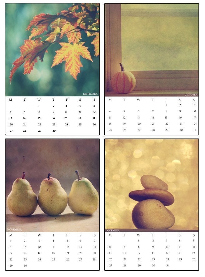
In 2010, I purchased this beautiful calendar from ChelseaVictoria on etsy. It has been on the wall in my husband’s office and I finally decided to take it down since it has been out-of-date for a good 6 months now, and I wanted to frame the pictures and hang them in a grouping. Each month was printed out on 5x7 photo paper, and the pictures themselves were 5”x5”. I wanted to hang a grouping of 9, so I went to IKEA in search of frames. I knew they had square frames that were matted to 5”x5”, so I looked there first, and I couldn’t believe the IKEA Ribba frames were $10 each! I’m pretty cheap, and there is no way I was spending $90 on frames. So I looked around, trying to find some cheaper frames. I found several that were $5, but no square frames. I had pretty much given up on my IKEA frame search and was wandering into the mirror section when I saw these MALMA mirrors for only $2.99 each.
I estimated that the mirror opening was about 4” wide (I could’ve gone and gotten one of the handy dandy tape measures, I know), which means I would have to trim a bit off the pictures, but at $3 each, they were definitely budget-friendly and I loved the big thick black frame that would surround each little picture.
So, I got 9 frames for less than $30! First, I measured the square opening (which actually ended up being closer to 3.75” square) and made a template out of chipboard that I could use as a cutting guide. I then cut around the chipboard guide after I determined how I wanted the picture to look, since I had to cut off a good bit on each side.
![]() |
| All the pictures cut to 3.75" squares. |
Next I had to add the hanging hardware that came with the MALMA mirrors. They come with two little eyelet screws and a length of white string, and I didn’t want to hang mine by string, so I just measured the middle of the frame and used my drill to make a small starter hole (I have no idea how you would get the screw started if you didn’t have a drill, IKEA always makes things difficult), then inserted the eyelet screw.
Then I fit each picture to the opening of its specific frame (some needed to be trimmed a little more to fit) and just attached them to the mirror with painter’s tape. So if I decide to change the pictures or if I want the mirrors intact, I won’t have an issue.
I decided to hang the pictures on an empty wall in my bathroom. I used a level and a tape measure to hang the nails 14” apart (if I had it to do again, I probably would’ve done it an inch or 2 closer). Since I just used the one eyelet to hang the frames, they were pretty crooked to begin with, they didn’t want to hang straight, so I used some painter’s tape on the back of the frame and used my level to make them straight and stuck them to the wall. One has already come loose, so I may need to use some Velcro or something with a little more friction to keep it in place.
And, voila! I paid $15 for the calendar (it was on sale), and around $30 for the frames, so I got a whole wall of art that packs a big punch for $45!
Wednesday, June 15, 2011
What I Want Wednesday!
It's Wednesday, which means "what" and "want" make for some awesome alliteration, and I want to share some things that I've been coveting recently.
![]() | ||||
| Feather Tea Towels from MichelleBrusegaard on Etsy. I love the color! |
![]() |
| Pad of Paper shaped like an iPhone! from becksorange on etsy. So creative. |
![]() |
| Patterned Notebook in Scallops by inkwhimsy on etsy. Only $5! |
![]() |
| Yellow grid-printed pillow from wickedmint on etsy. Love the chair too! Read how she found it on the side of the road on her blog. |
![]() | ||
| Rain Drop Coasters by Bonni1982 on etsy. So cute! |
Hope you guys are having a great week, our air conditioner is broken in my office, so we're sweating it out to avoid having to mingle with people in the other parts of the office that we may not be too fond of. But on the upside, we get to wear tank tops to work!
Tuesday, June 14, 2011
"like" me?
I'd really like it if you "like" me on facebook, and i will like you forever!
I'm hosting a giveaway for two free art prints, and all you have to do is become a fan on facebook to enter!
Good luck!
I'm hosting a giveaway for two free art prints, and all you have to do is become a fan on facebook to enter!
Good luck!
Friday, June 10, 2011
fill in the blank fridays
1. This weekend I'm hosting a couples baby shower for our friends beth & be. they're our first friends to have a baby, so it'll be interesting to see how this shift to parents affects them so we'll get a glimpse into that world - which will probably affect whether or not we decide to have kids.
2. My last vacation was at the beginning of May we went to the Dominican Republic!
3. My next vacation will be who knows... before this last vacation we hadn't really been on a vacation since our honeymoon 2.5 yrs ago...
4. My favorite way to relax is just cuddling on the couch with my doggy, watching tv or reading a book.
5. When vacationing one should always wear sunscreen! geez, I say this every time - we're gonna be good about reapplying sunscreen so we don't get burnt - and it never fails that we get burnt.
6. When vacationing one should never worry- just relax and forget about life for a bit.
7. The best part about a vacation is getting away from work for a little while.
Subscribe to:
Posts (Atom)